When you decide to remodel or refresh a room in your home, you may start with a blank slate, and the color possibilities, while endless, can feel overwhelming. How do you choose a color that will create the kind of space you want to live in? What color combinations are complementary?
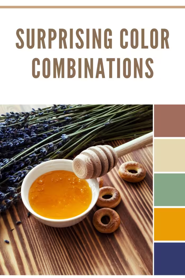
First, you’ll want to select a wall color that will coordinate with your choices for furniture and decor. You may choose these pieces and fabrics first, then incorporate the wall color as you will have many more choices of paint color than when choosing fabric.
You’ll also want to consider the room’s function; how will color affect how you want to live in the space? Is it a cool and airy bathroom? A formal dining room or a cozy corner?
If you’ve already spent hours flipping through Pinterest and haven’t found any ideas that resonate with you, here are nine unusual paint and decor color combinations for you to consider.
Colors collide, and unexpected alliances emerge. Surprising pairings defy norms, capturing eyes and stirring emotions. The art of hue harmony unfolds.
9 Surprising Color Combinations
Coral and Emerald Green Color Combination
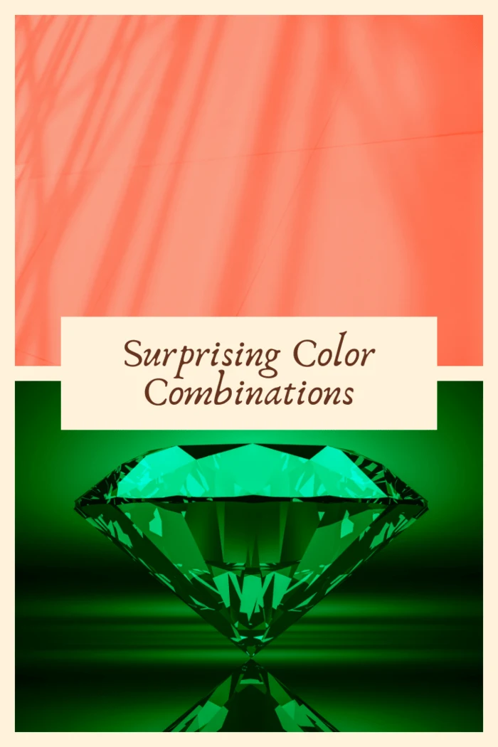
Coral and emerald green are a surprisingly captivating color combination that effortlessly blends vibrancy with sophistication. The popularity of emerald green has soared recently, making it a go-to choice for various home decor elements such as furniture, throw pillows, blankets, and upholstery fabrics. However, the addition of coral truly elevates this pairing to new heights.
Coral, with its delicate and captivating hue, is the ideal counterpart to the depth and richness of emerald green. When used with emerald, coral colors create a striking visual contrast that is visually appealing and emotionally stimulating. The juxtaposition of the lighter coral tone against the darker emerald shade generates a harmonious balance, infusing the space with a perfect blend of softness and drama.
Imagine adorning your walls with a soothing and light coral hue, creating an atmosphere of tranquility and serenity. This gentle coral backdrop is a versatile canvas, allowing the emerald green accents to take center stage. Whether through emerald green furniture, statement pieces, or intricate patterns, the depth and intensity of this lush hue add a touch of opulence to the overall aesthetic.
Incorporating emerald green into your decor scheme brings a sense of vitality and rejuvenation to any space. Its lushness connects with nature, evoking images of lush forests and verdant landscapes. Paired with coral, this combination creates a refreshing and energizing ambiance that awakens the senses and invigorates the soul.
Moreover, the union of coral and emerald green transcends mere aesthetics. It represents the fusion of two powerful forces: the serenity and tranquility associated with the ocean’s coral reefs and the revitalizing energy of the lush greenery found in the depths of tropical forests. This unexpected pairing delights the eye and evokes a profound emotional response, creating a unique and memorable environment.
Consider incorporating coral and emerald green in various elements throughout the room when implementing this color combination. Allow coral to shine through in larger surfaces, such as walls or curtains, while using emerald green to make a bold statement through accent pieces, artwork, or upholstery. The interplay between these colors will infuse your space with a sense of sophistication, modernity, and undeniable charm.
In conclusion, the combination of coral and emerald green is an extraordinary pairing that pushes the boundaries of conventional design. The lusciousness of emerald green harmonizes beautifully with the delicacy of coral, creating a visually striking and emotionally captivating environment. Whether you choose to embrace this color combination in your living room, bedroom, or even a workspace, be prepared to experience the perfect fusion of softness, drama, and a touch of the extraordinary.
Lime Green and Sunny Yellow Color Combination
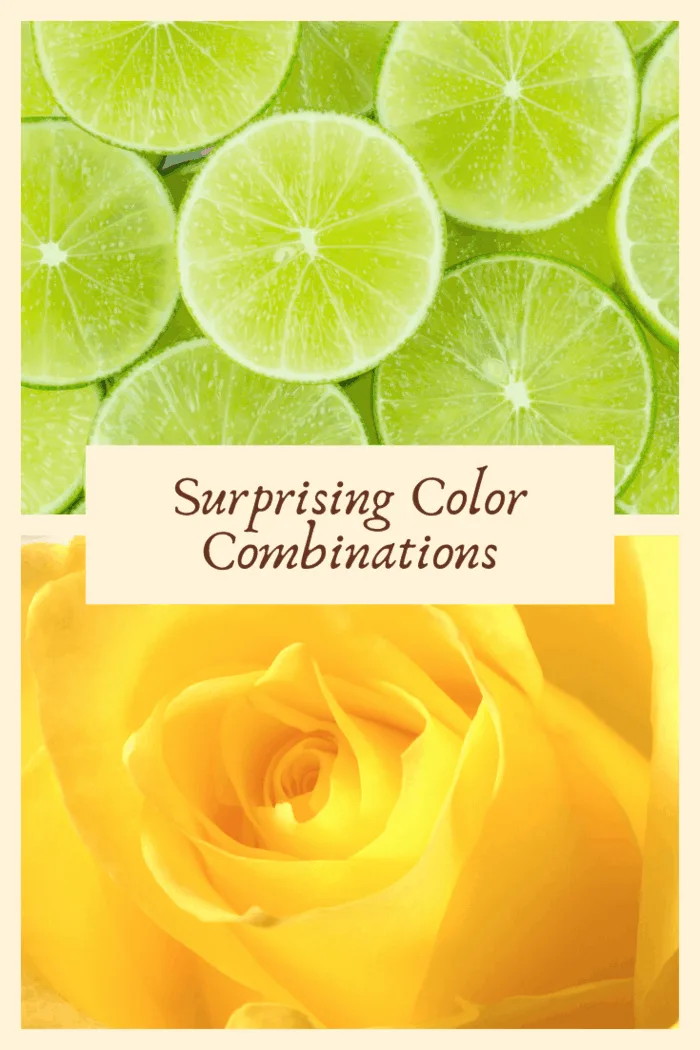
Sound just a little too bright? Think again. Accenting warm, sunny yellow walls with lime green can brighten even the darkest spaces. Combining these colors with white will prevent them from overpowering the room. Consider painting just one wall yellow as a feature wall. Yellow and green will also work well in brighter rooms like a sitting room, a sunroom, or a dining room with many windows.
Lime green and sunny yellow create a surprising color combination due to their contrasting yet complementary nature. These two vibrant and energetic hues come together to catch the eye and elicit a sense of excitement and joy.
At first glance, lime green and sunny yellow may seem like an unconventional pairing. With its bright and zesty appearance, lime green exudes a sense of freshness and vitality. On the other hand, sunny yellow radiates warmth, cheerfulness, and a touch of optimism. The unexpected fusion of these two intense shades makes their combination surprising and visually captivating.
The juxtaposition of lime green and sunny yellow creates a dynamic contrast that draws attention and stimulates the senses. Lime green’s cool and slightly neon undertones stand out against the warmth of sunny yellow, resulting in a harmonious clash of energetic hues. This combination creates a visual impact that is both bold and invigorating, making it ideal for those seeking to make a statement with their color choices.
Furthermore, lime green and sunny yellow evoke a sense of playfulness and creativity when used together. Their vibrant and lively qualities inspire excitement and fun in any space or design. Whether utilized in fashion, interior design, or graphic art, this unexpected color duo adds a sense of spontaneity and youthful energy to the overall aesthetic.
The surprising aspect of this combination also lies in its ability to evoke a sense of nostalgia. The pairing of lime green and sunny yellow can transport us back to memories of sunny summer days, lemonade stands, and the refreshing scent of freshly cut limes. It taps into our subconscious associations with nature, citrus fruits, and the exuberance of the outdoors, creating a unique and evocative sensory experience.
It’s important to balance the two hues when incorporating lime green and sunny yellow. Their intensity calls for thoughtful use, and anchoring them with neutral or softer tones is often recommended to avoid overwhelming the space. Consider using lime green and sunny yellow as accent colors in a predominantly neutral setting, or incorporate them into patterns and prints to add pops of excitement and visual interest.
In conclusion, lime green and sunny yellow form a surprising color combination due to their contrasting yet harmonious qualities. Their ability to create a dynamic visual impact while evoking feelings of freshness, warmth, and playfulness makes them an intriguing choice for those seeking an unexpected burst of energy and joy in their designs. Embrace the surprising allure of lime green and sunny yellow, and let their vibrant hues bring a sense of excitement and liveliness to your world.
Orange and Blue
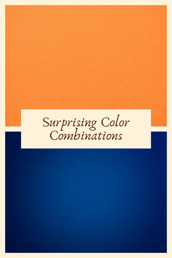
Anyone who looks at a color wheel will note that the contrasting colors of orange and blue pair well together. That’s why graphic designers often employ this duo for book covers, movie posters, and company logos. They work well together! This combination of rich blue walls with darker orange fabrics creates a warm and cozy space. It’s ideal for den, study, or even a luxurious bedroom. Adding light-colored leather to the room is a wonderfully subtle way to bring in the orange tone.
Orange and blue create a surprising color combination due to their strong visual contrast and the way they evoke different moods and associations. This pairing challenges traditional color theories and captivates the eye with its unexpected vibrancy.
One of the main reasons orange and blue create a surprising combination is their position on the color wheel. They sit opposite each other, making them complementary colors. Complementary colors are known for their striking contrast and ability to enhance each other’s intensity when placed side by side. With its warm and energetic characteristics, Orange stands in stark contrast to blue, which is cool and calming. This stark juxtaposition creates an intriguing visual tension that commands attention.
Additionally, orange and blue are often associated with different emotions and environments. Orange is reminiscent of warmth, energy, and enthusiasm. It is often associated with the sun, fire, and autumn foliage. On the other hand, blue is linked to calmness, serenity, and the vastness of the sky and sea. Its cool undertones evoke a sense of tranquility and stability. When these two contrasting moods come together, they create an unexpected fusion that sparks curiosity and interest.
Moreover, the combination of orange and blue can be surprising because it challenges traditional color associations. Historically, orange and blue were considered challenging to combine due to their stark contrast. However, breaking these conventions and embracing unconventional color pairings has become a trend in contemporary design. This willingness to experiment with unexpected combinations has contributed to orange and blue’s surprising and refreshing appeal.
The surprising nature of orange and blue can also be attributed to their versatility. This color duo can be adjusted to different hues and shades, allowing for various interpretations. For example, a vibrant and saturated orange paired with a deep navy blue can create a bold and dramatic effect. In contrast, softer pastel shades of orange and blue can convey a more delicate and harmonious ambiance. The specific shades chosen and the balance between them greatly influence the overall impact and unexpectedness of the combination.
When using orange and blue together, it is essential to consider the context and purpose of the design. Whether applied to fashion, interior design, or graphic art, the key is to find the right balance between the two hues. The contrasting nature of orange and blue calls for thoughtful placement and the use of neutral tones or supporting colors to create harmony and cohesion.
In conclusion, orange and blue form a surprising color combination due to their contrasting characteristics, emotional associations, and historical color theories. The unexpected visual impact created by their stark contrast and the ability to challenge traditional color conventions make them an intriguing choice for those seeking to add a touch of excitement and uniqueness to their designs. Embrace the surprising allure of orange and blue, and allow their contrasting hues to captivate and inspire.
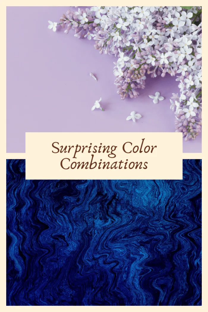
Lilac and Dark Blue Color Combination
Lilac is another hot color this year. Teaming it with dark blue is a great way to make the color more approachable and a lot less feminine. Used well, it can give a space an elegant and vintage feel. Bringing in some dark blue accents with a lilac wall color works very well for a living room or any space meant to entertain visitors.
Lilac and dark blue create a surprising color combination due to their contrasting qualities and the unique atmosphere they evoke. The unexpected pairing of these two hues captures attention and offers a sense of sophistication and intrigue.
The juxtaposition of their tonal qualities is the surprising aspect of lilac and dark blue. With its delicate and pastel nature, Lilac conveys a sense of softness, femininity, and elegance. On the other hand, dark blue exudes depth, strength, and a touch of mystery. These two contrasting colors combine to create a dynamic interplay that piques curiosity and offers an unconventional aesthetic.
The contrast between lilac and dark blue can also be attributed to their positioning on the color spectrum. Lilac falls within the purple family, while dark blue belongs to the blue family. These two color families are typically considered distinct and separate, making their combination surprising and visually captivating.
Furthermore, the emotional associations of lilac and dark blue add to the surprising nature of this color pairing. Lilac is often associated with romance, grace, and tranquility, while dark blue is linked to calmness, authority, and depth. By combining these hues, you create a captivating fusion that balances the delicate and ethereal qualities of lilac with the strong and introspective nature of dark blue. This unexpected blend of emotions adds depth and complexity to the overall aesthetic.
The combination of lilac and dark blue can also evoke a sense of nostalgia and evoke specific atmospheres. The dreamy and soft lilac can transport us to moments of serenity and innocence, while the deep and rich tones of dark blue can conjure images of midnight skies or the ocean’s vastness. This juxtaposition of moods creates an ambiance that is both surprising and emotionally evocative.
When incorporating lilac and dark blue into a design, finding the right balance between the two hues is essential. Consider using lilac as the dominant color and incorporating dark blue as accents or in smaller doses to create contrast and visual interest. This approach allows the unexpected nature of the combination to shine while maintaining a cohesive and harmonious overall look.
In conclusion, the combination of lilac and dark blue is surprising due to the contrast between their tonal qualities, their position on the color spectrum, and the emotional associations they evoke. By combining the delicate and ethereal nature of lilac with the depth and strength of dark blue, this pairing creates an atmosphere of sophistication, mystery, and unexpected beauty. Embrace the surprising allure of lilac and dark blue, and let their contrasting hues inspire and captivate your senses.
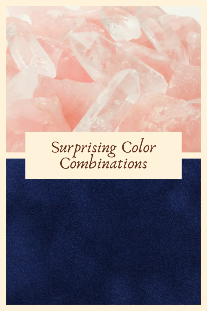
Navy Blue and Blush Color Combination
Painting your walls a blush color can create a dreamy, comforting space, making it ideal for bedrooms. You can create a beautiful, calming place to relax in the right tone, paired with a navy blue or a neutral bedspread with navy blue pillows and throws.
Navy blue and blush create a surprising color combination due to the unexpected balance they strike between boldness and softness. These contrasting hues combine to create a visually captivating and emotionally intriguing pairing.
The surprise factor of navy blue and blush lies in their inherent contrast. Navy blue, with its deep and rich tone, exudes a sense of strength, sophistication, and timeless elegance. On the other hand, blush, a delicate and soft shade of pink, radiates femininity, tenderness, and a touch of innocence. The combination of these contrasting qualities creates a visually striking and harmonious interplay.
Furthermore, navy blue and blush belong to families of different colors. Navy blue is a member of the blue family associated with calmness, depth, and stability. Conversely, Blush belongs to the pink family, symbolizing sweetness, romance, and sensitivity. The unexpected pairing of these two distinct color families challenges traditional color conventions and adds a touch of novelty and excitement to the overall aesthetic.
The emotional associations of navy blue and blush also contribute to the surprising nature of this combination. Navy blue evokes a sense of confidence, authority, and classic sophistication. It often brings to mind images of the night sky or the ocean’s deep waters. In contrast, blush carries associations of softness, delicacy, and a gentle charm. These emotional qualities merge in the navy blue and blush combination, creating a unique blend of strength and vulnerability that intrigues and captivates the viewer.
Moreover, the combination of navy blue and blush allows various interpretations and applications. This pairing can evoke different moods and atmospheres depending on the specific shades chosen. A darker navy blue with a blush accent creates a more formal and sophisticated ambiance, ideal for elegant events or refined interior designs. On the other hand, a lighter navy blue and blush combination can bring a sense of freshness, playfulness, and romance to a space or ensemble.
When incorporating navy blue and blush into a design, finding the right balance between the two hues is important. Consider using navy blue as the dominant color, providing a strong foundation, and incorporating blush as accents or in smaller doses to add a touch of softness and femininity. This approach ensures that the surprising contrast between the two colors remains visually engaging while maintaining a cohesive and harmonious overall look.
In conclusion, the combination of navy blue and blush is surprising due to the unexpected balance they strike between boldness and softness. The contrasting nature of these hues, their distinct color family associations, and the emotional qualities they evoke make this pairing visually captivating and emotionally intriguing. Embrace the surprising allure of navy blue and blush, and let their contrasting hues inspire and create a captivating ambiance.
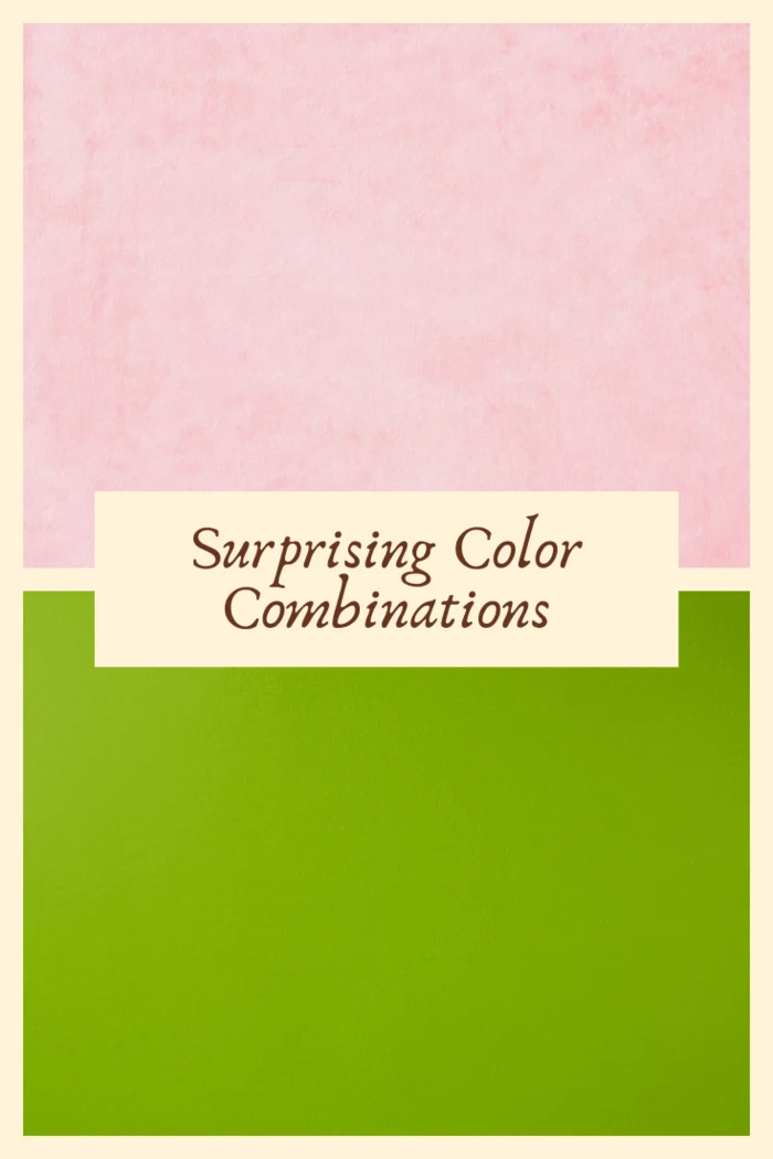
Pink and Green Color Combination
Bubble-gum pink is making a comeback. It’s a bold but fun choice of paint color. If you love this bright pink trend but feel it’s overwhelming as a wall color, paint just one or two accent walls with shades of white to offset it. A rich, leafy green pairs well with vivid pink. Pack this room with vibrant greens and live plants to create a lively, energetic room. It’s unbeatable for home offices or playrooms.
Pink and green create a surprising color combination due to the unexpected juxtaposition of their vibrant and contrasting qualities. This pairing challenges traditional color associations and offers a fresh and captivating aesthetic that catches the eye.
One of the main reasons pink and green form a surprising combination is their contrasting positions on the color spectrum. Pink, with its delicate and soft characteristics, is associated with femininity, sweetness, and tenderness. On the other hand, green symbolizes nature, growth, and vitality, representing freshness, harmony, and a connection to the outdoors. The fusion of these two distinct colors creates an intriguing visual tension that is both surprising and visually captivating.
The surprise factor of pink and green also lies in the unexpected emotional associations they evoke. Pink often carries connotations of romance, sensitivity, and playfulness, while green is linked to balance, renewal, and a sense of calm. Combining these hues creates a dynamic fusion that merges the soft and whimsical qualities of pink with the rejuvenating and vibrant nature of green. This unexpected blend of emotions adds depth and complexity to the overall aesthetic.
Furthermore, pink and green challenge conventional color theories that pair green with more earthy or natural tones. Adding pink injects a burst of energy and youthful charm into the combination, breaking away from traditional expectations. This departure from the norm adds an element of surprise and freshness to the color palette, making it an intriguing choice for those seeking to create a visually captivating and unique design.
The combination of pink and green also allows for many interpretations and applications. The specific shades chosen within each color family greatly influence the overall impact. For example, pairing a soft pastel pink with a minty green creates a dreamy and whimsical ambiance, while a vibrant hot pink with a lime green generates a bold and energetic atmosphere. This versatility of pink and green opens up endless possibilities for creativity and experimentation.
When incorporating pink and green into a design, finding the right balance and harmony between the two hues is important. Consider using pink as the dominant color, with green accents or vice versa, to create a focal point and provide visual interest. This approach ensures that the surprising contrast between pink and green remains visually engaging while maintaining a cohesive and harmonious look.
In conclusion, the combination of pink and green is surprising due to their unexpected contrast, challenging traditional color associations and offering a fresh and captivating aesthetic. The fusion of their vibrant and contrasting qualities and the emotional associations they evoke makes this pairing visually intriguing and emotionally stimulating. Embrace the surprising allure of pink and green, and let their contrasting hues inspire and create a vibrant and unique ambiance.
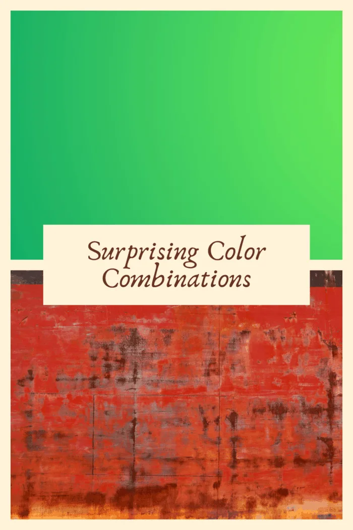
Teal and Rusty Red Color Combination
Combining a deep teal with rusty red accents will create a striking contrast and a luxurious space. Teal walls pair perfectly with the warmer accents of copper fixtures or rust-toned furniture. If enough natural light is present, this combination adds drama and interest to a kitchen or dining room. The attractive colors encourage guests to sit and stay awhile.
Teal and rusty red create a surprising color combination due to their contrasting yet harmonious qualities, which captivate the eye and evoke a sense of depth and visual intrigue.
One of the main reasons teal and rusty red form a surprising combination is their stark contrast in the color spectrum. Teal, a cool-toned shade of blue-green, is associated with calmness, tranquility, and a hint of mystery. On the other hand, rusty red exudes warmth, intensity, and a touch of earthiness. The unexpected fusion of these distinct hues creates a captivating visual tension that commands attention and sparks curiosity.
Moreover, teal and rusty red represent different emotional and symbolic associations. Teal is often linked to serenity, healing, and a connection to nature, while rusty red conveys passion, strength, and a sense of warmth. By combining these contrasting emotions, the color combination generates a complex and intriguing ambiance, adding depth and richness to the overall aesthetic.
The surprising nature of teal and rusty red also lies in their ability to evoke a range of atmospheres and moods. Teal brings a sense of coolness and tranquility reminiscent of ocean waves or lush forests. In contrast, rusty red exudes warmth and evokes images of autumn foliage or rustic landscapes. Combining these hues creates a visual narrative that can convey a feeling of balance, juxtaposing cool and warm elements within the design.
Additionally, teal and rusty red challenge traditional color conventions, as they are not commonly paired together. This departure from the expected creates an element of surprise and uniqueness in the color palette, making it visually captivating and refreshing. The unexpected fusion of these colors encourages creativity and invites viewers to explore new visual possibilities.
When incorporating teal and rusty red into a design, finding the right balance and harmony between the two hues is essential. Consider using teal as the dominant color, providing a sense of calm and grounding, while incorporating rusty red as accents or in smaller doses to add warmth and visual interest. This approach ensures that the surprising contrast between teal and rusty red remains visually engaging while maintaining a cohesive and harmonious look.
In conclusion, teal and rusty red create a surprising color combination due to their contrasting yet harmonious qualities. Fusing their distinct hues, emotional associations, and unexpected visual impact adds depth, richness, and intrigue to any design. Embrace the surprising allure of teal and rusty red, and let their contrasting hues inspire and create a captivating and unique ambiance.
Green and Red Color Combination
Deep green and red jewel tones are often a traditional color combination, but if you consider changing the shades of red and green, you can achieve an updated look. The perfect combination is a muted red with a rich, mossy green accent for your walls. Add a bit of mustard yellow to help bring the colors together. The look is timeless with a bit of contemporary flair.
Green and red create a surprising color combination due to their strong visual contrast and the cultural associations tied to this pairing. These two hues are complementary colors that evoke different moods and symbolisms, making their combination intriguing and unexpected.
The surprise factor of green and red lies in their position on the color wheel. Green, associated with nature, growth, and tranquility, is typically perceived as a calming and refreshing color. On the other hand, red is bold, energetic, and often associated with passion, intensity, and excitement. The striking contrast between the coolness of green and the warmth of red creates a visual tension that catches the eye and adds visual intrigue.
Additionally, green and red carry strong cultural and symbolic associations. Red is frequently linked to love, celebration, and power, while green is often associated with life, fertility, and renewal. Traditionally, red and green are prominently featured during holidays like Christmas, symbolizing joy, festivity, and the season’s spirit. This cultural context further adds to the surprising nature of their combination, as they are strongly associated with specific contexts and events.
Moreover, the unexpected aspect of green and red arises from their ability to evoke different emotional responses. Green’s calming and grounding qualities can create a sense of balance and serenity, while red’s vibrant and stimulating nature can elicit excitement and energy. Combining these contrasting emotions within a color palette or design generates a captivating dynamic that engages the viewer and sparks interest.
The surprising allure of green and red is also evident in their versatility. This combination can evoke various atmospheres and aesthetics depending on the specific shades and tones chosen. For example, pairing a vibrant, grassy green with a bold cherry red can create a lively and energetic ambiance. On the other hand, pairing a muted sage green with a deep burgundy red can evoke a more sophisticated and elegant atmosphere. This versatility allows for creative exploration and invites designers to play with different expressions of color combinations.
When incorporating green and red into a design, finding the right balance and harmony between the two hues is important. Consider using green as the dominant color and incorporating red as an accent or in smaller doses to create visual interest and focal points. This approach ensures that the surprising contrast between green and red remains visually engaging while maintaining a cohesive and harmonious look.
In conclusion, green and red create a surprising color combination due to their strong visual contrast, cultural associations, and the range of emotions they evoke. The unexpected fusion of their distinct hues and their surprising impact on the viewer’s perception make this pairing intriguing and visually captivating. Embrace the surprising allure of green and red, and let their contrasting hues inspire and create a vibrant and unique ambiance.
Neutrals Only
Neutrals have made a strong comeback in recent years. Far from boring, today’s neutral palette includes slate grays, tans, and off-whites, creating a cool contemporary vibe. They are the perfect colors for all minimalists, making a room feel fresh and light. Choosing only neutrals allows you to mix and match decorative items and accent colors and is an inexpensive way to update the look of a room. Neutrals are perfect for living spaces, dining rooms, and even bedrooms.
Neutrals, by definition, are colors that lack strong chromatic intensity and are often considered more subdued or muted. They typically include shades of white, black, gray, beige, and brown. While neutrals are often used as a foundation or backdrop for other colors, their combination alone is not necessarily surprising.
Neutrals are popular for their versatility, timeless appeal, and ability to create a calm and harmonious atmosphere. They are frequently used in interior design, fashion, and other creative disciplines to provide balance, allow other colors to stand out, or create a minimalist aesthetic. Neutrals are often associated with qualities like simplicity, elegance, and sophistication.
However, surprising color combinations typically involve unexpected or contrasting pairings that deviate from traditional color schemes. These combinations can include bright and bold colors or hues that are not commonly associated with each other. The element of surprise often arises from the unexpected nature of the pairing and the unique visual impact it creates.
While neutrals can be combined with other colors to create striking contrasts, such as pairing black with white or beige with a vibrant accent color, neutrals are not inherently surprising when combined. Their subtle and understated nature creates a cohesive and harmonious look rather than one that surprises or captivates through contrast or unexpected color choices.
That being said, creativity and personal taste play a significant role in design, and it is possible to create surprising combinations even with neutrals. By experimenting with texture, pattern, materials, or unexpected pairings with other elements like shape or scale, neutrals can be used in innovative ways to create surprising and visually engaging designs. However, the surprise in these cases typically comes from the design approach or the use of unconventional techniques rather than solely relying on the neutrals themselves.
Final Thoughts
Finding just the right color combination is often intimidating. Hire a professional painter! A professional painter can help you choose the right shade by sampling colors within the room (not in the harsh light of a big box store!), then will properly apply each coat so that you can enjoy your new colors for years to come, shares The Spruce.
In the world of colors, surprises can be found in unexpected pairings and combinations that challenge conventions and evoke unique emotions. While neutrals may not typically be considered surprising on their own, their versatility and ability to complement other colors allow for endless possibilities when creating captivating and unexpected designs. By incorporating neutrals in innovative ways, such as through texture, pattern, or unconventional applications, designers can still infuse a sense of surprise and intrigue into their creations. Ultimately, the magic of color lies in the artist’s ability to experiment, push boundaries, and explore new combinations that captivate and inspire.
Some great interior painters can help you turn your vision of color into a room with your unique style. Have fun, and be bold! Give one of our color combinations a try!

